Harbinger & Harken
Dream up tasty new visions for sister bakeries.
- Illustration
- Merchandise
- Packaging
The identities for the sister bakeries reflect each venue’s unique personality and the Charleston neighborhood they’re based in and serve.
Founders Cameron Neal and Greer Gilchrist built a friendship while working together at a Washington D.C. cafe — and dreamed of opening a place of their own. In 2017, they opened The Harbinger in downtown Charleston, SC. Two years later, building on The Harbinger’s success and devoted following, they opened a sister bakery and cafe, The Harken, in Charleston’s French Quarter.
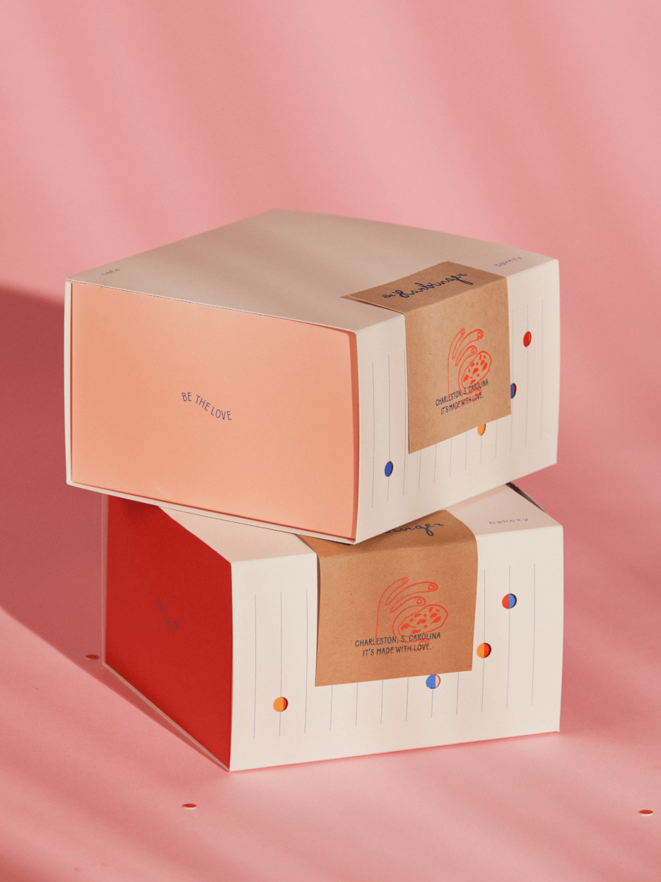
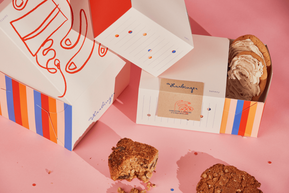
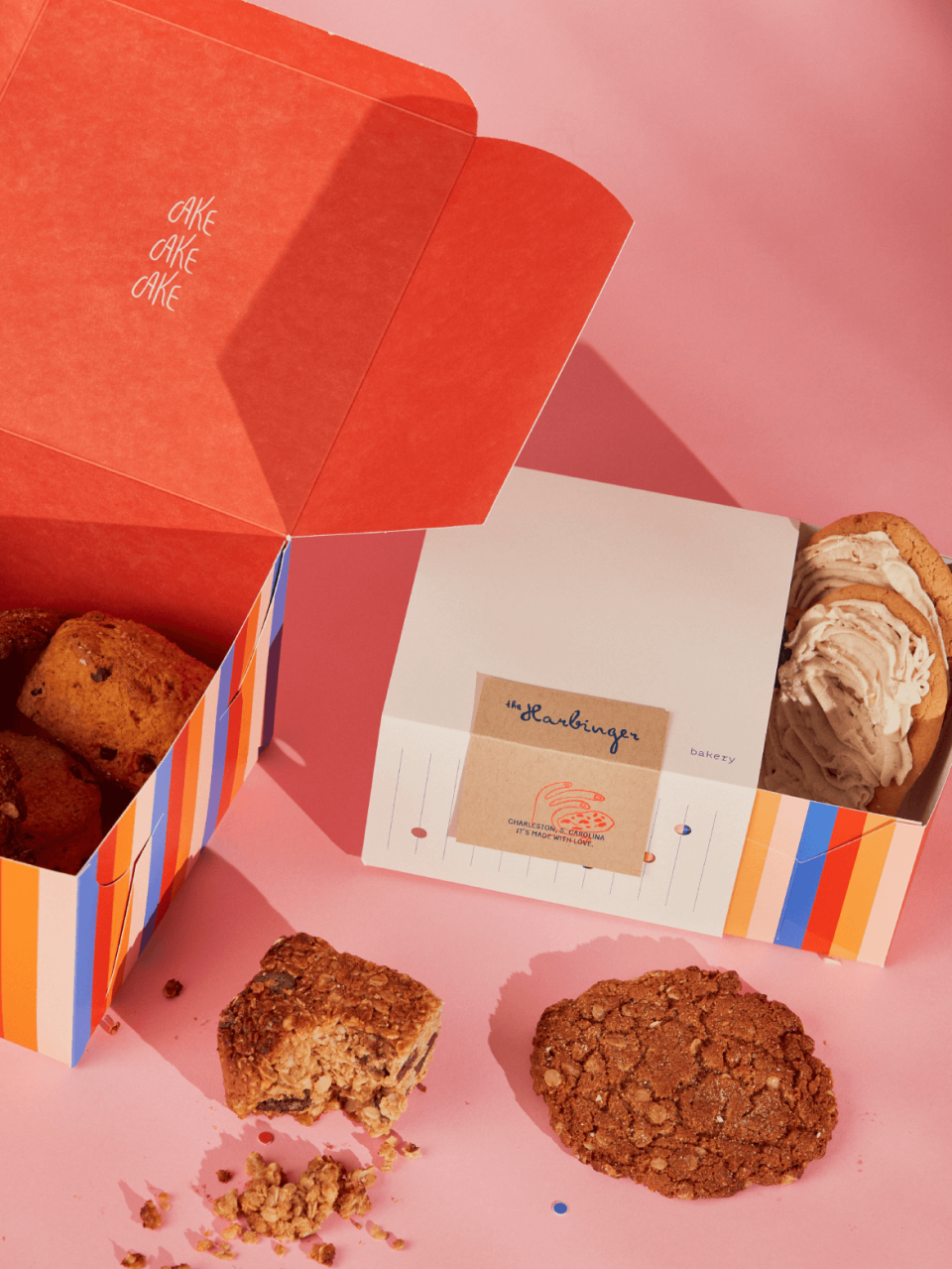
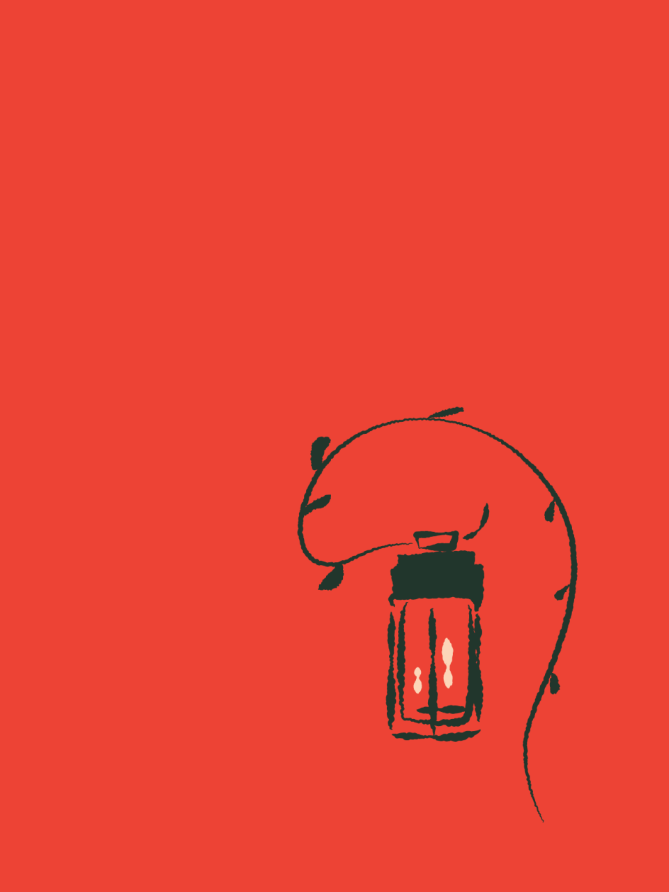
After several years of growth and success, the founders asked us to rethink the packaging for The Harbinger. Playing off the delightful energy of their cozy, welcoming space, we eschewed traditional pastry and cake boxes in favor of a more interactive, playful experience. Hand drawn illustrations, clever copy, bright colors, and a die-cut box and sliding sleeve create a colorful interplay: a sweet prelude to the surprise and delight inside the box.
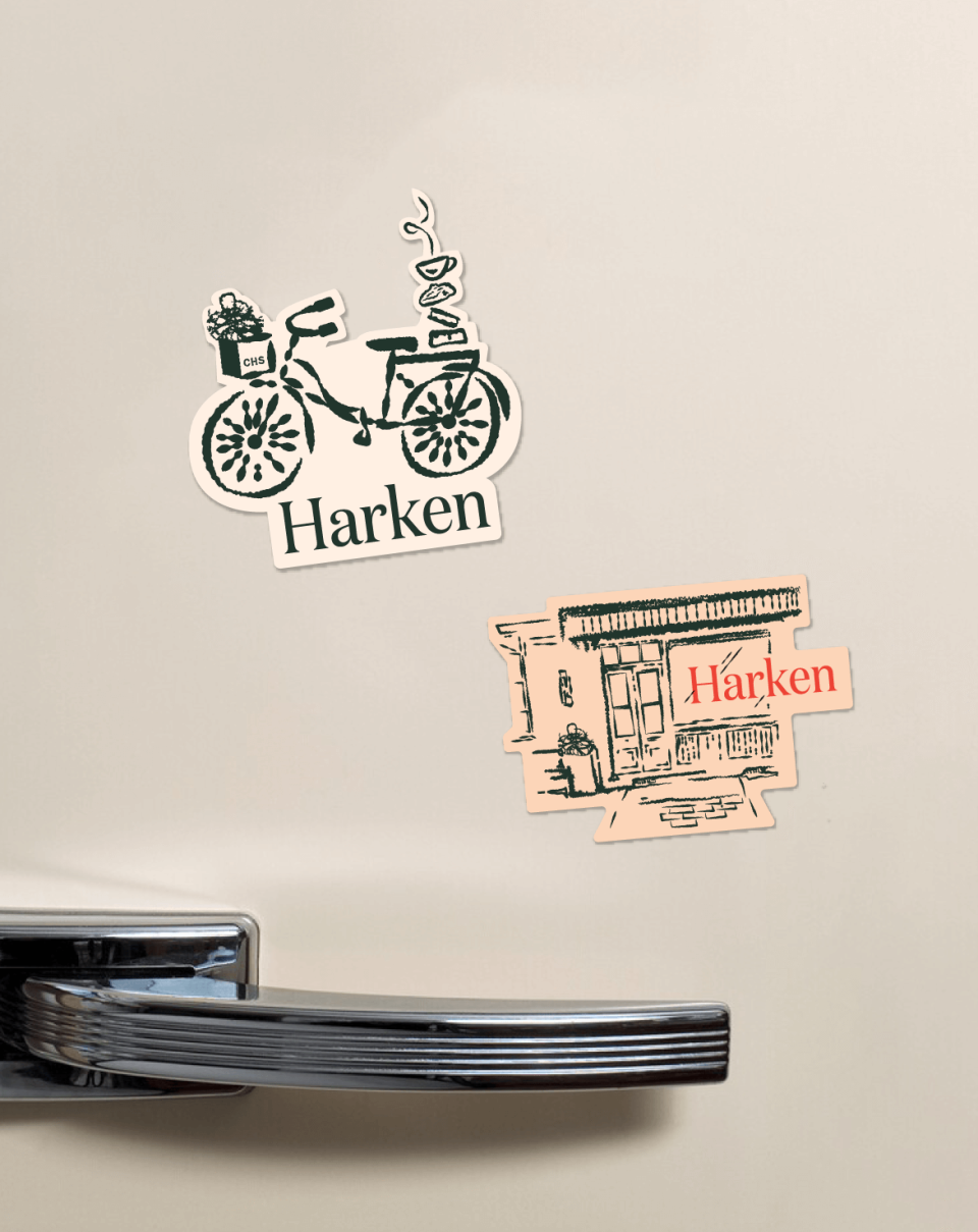
Before long, the founders invited us to refresh Harken’s identity. The brand evolution is sweet and expressive, adding playful layers.
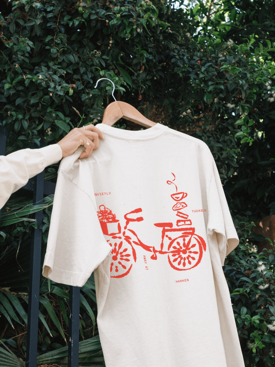
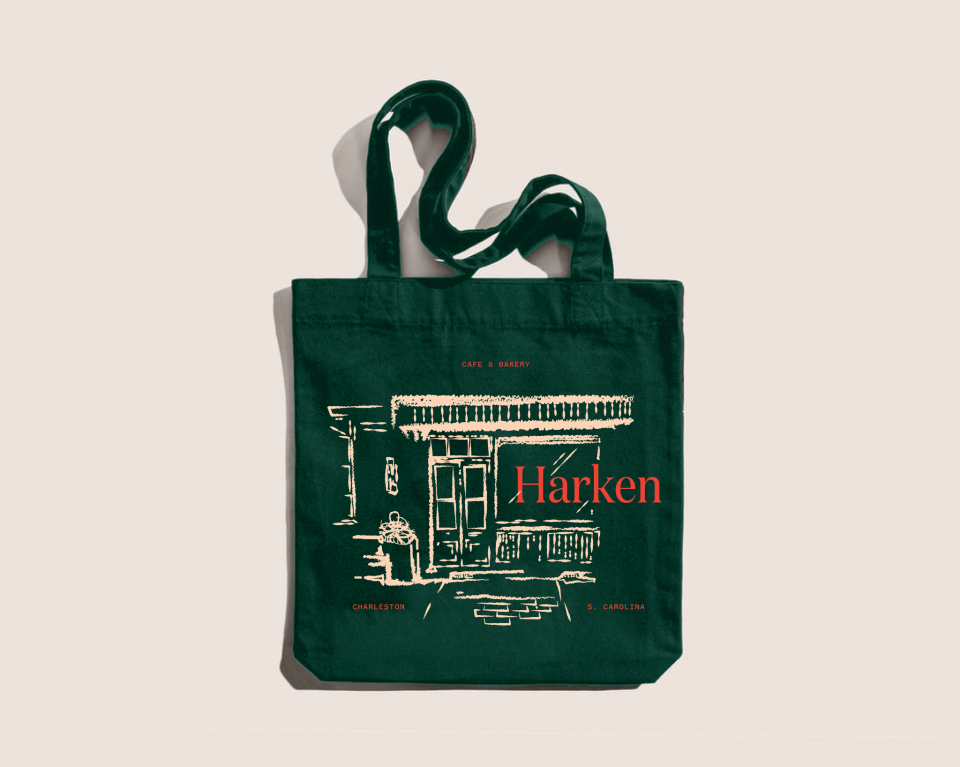
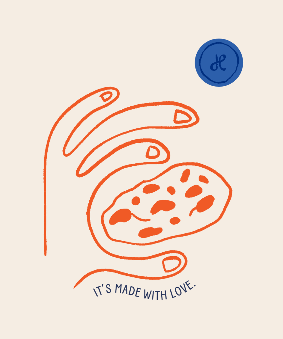
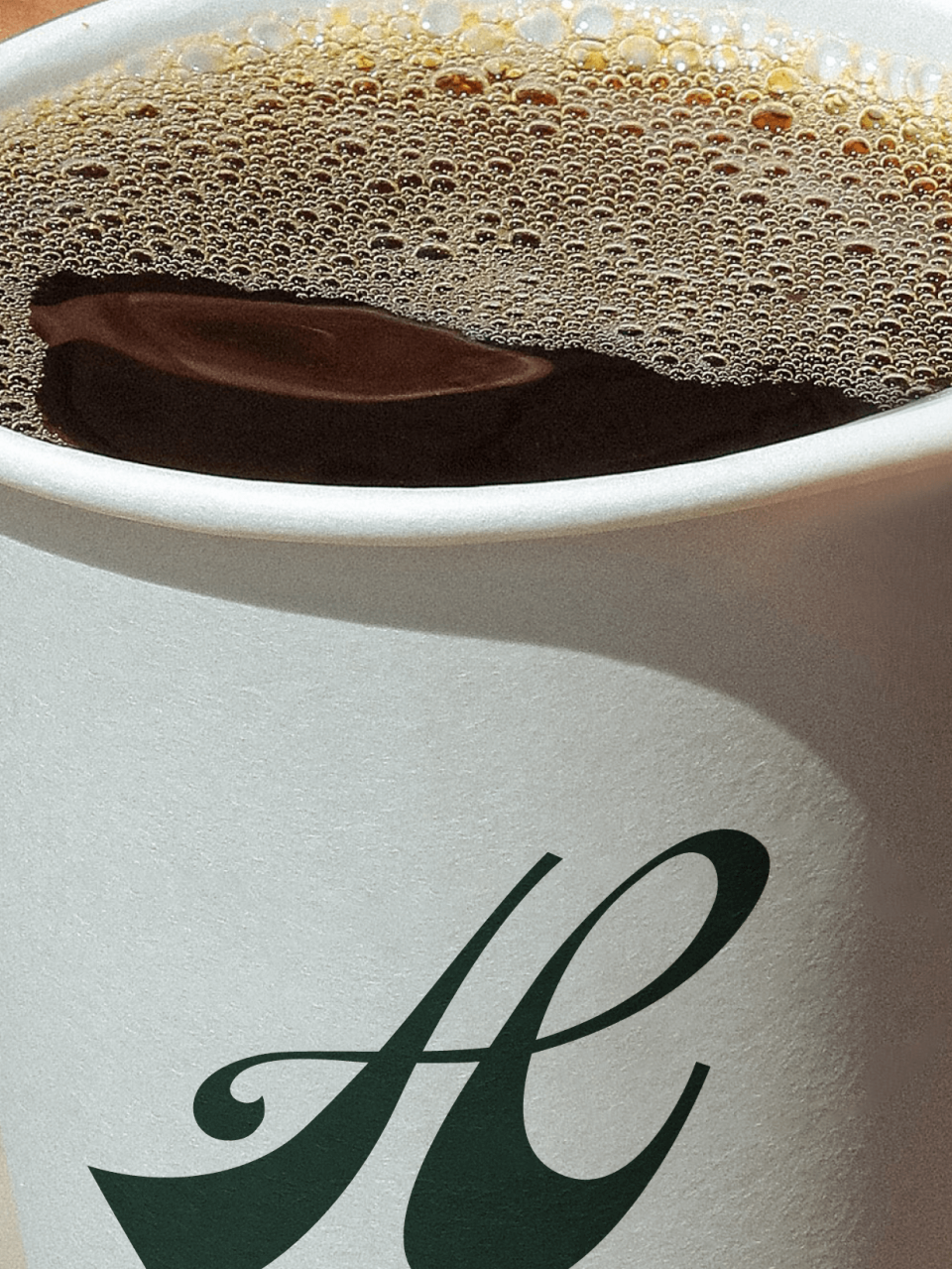
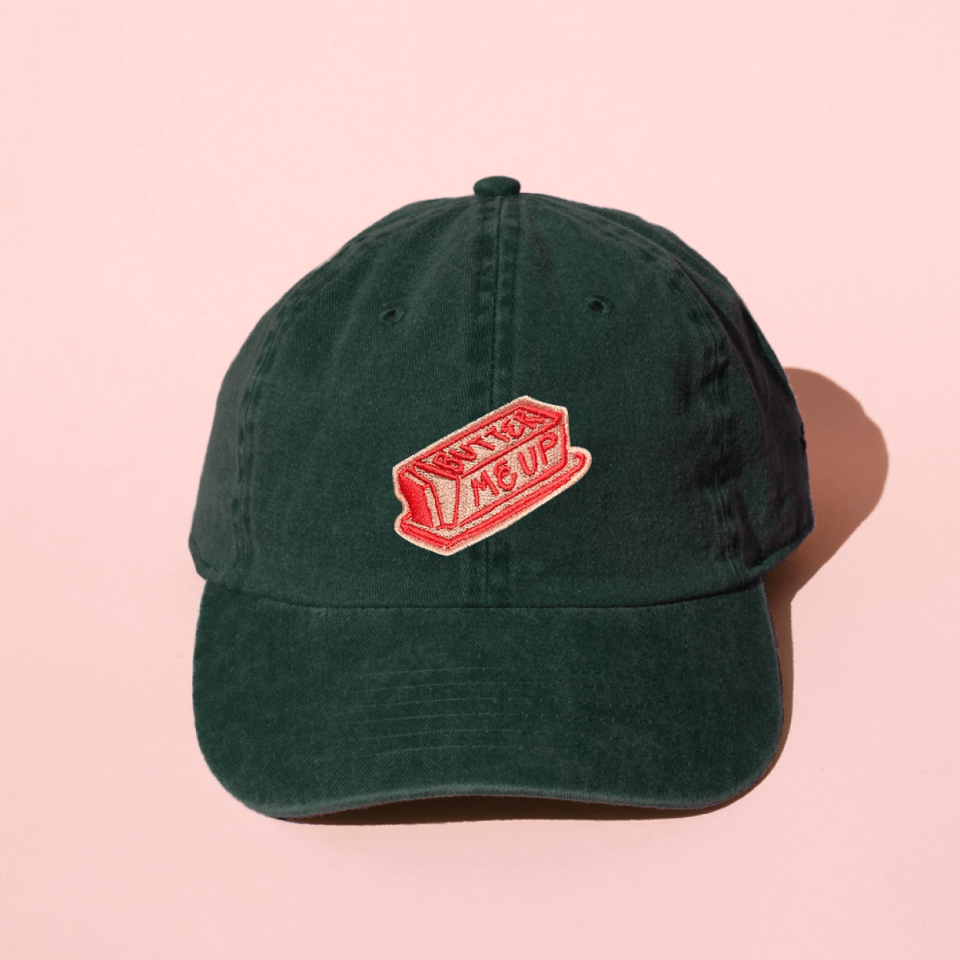
A collection of whimsical illustrations highlight the brand’s warmth and work in tandem with the existing botanical patterns and monogram, creating a robust visual language that works seamlessly across mediums.
We relish the opportunity to work on related yet distinct brands that ask us to think and create more expansively. Response to The Harbinger’s packaging and The Harken’s refreshed identity has been overwhelmingly positive, filling customers, staff, friends, and family with joy, and of course, delicious treats.