Parchie
Objective
Design the strategy, story, design, and packaging for a watch company born from a child’s imagination.
Capabilities
- Animation
- Art Direction
- Brand Identity
- Brand Positioning
- Copywriting
- Illustration
- Packaging
- Photography
- Photography Art Direction
- Product Development
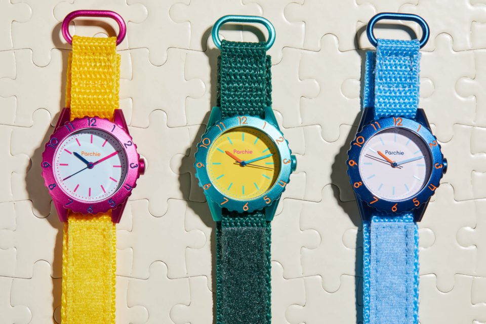
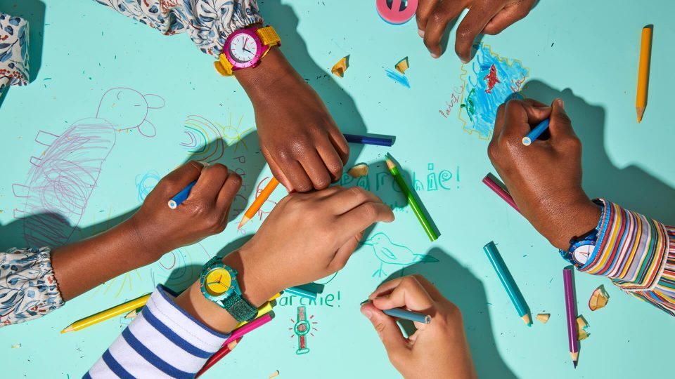
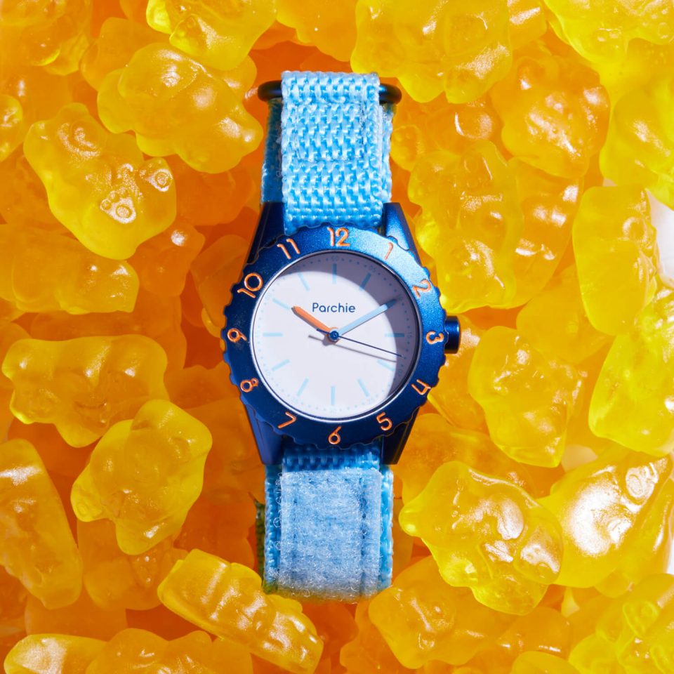
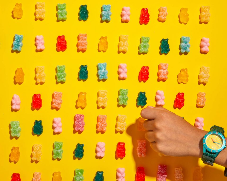
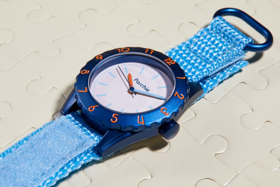
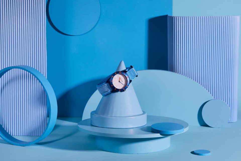
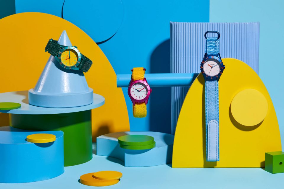
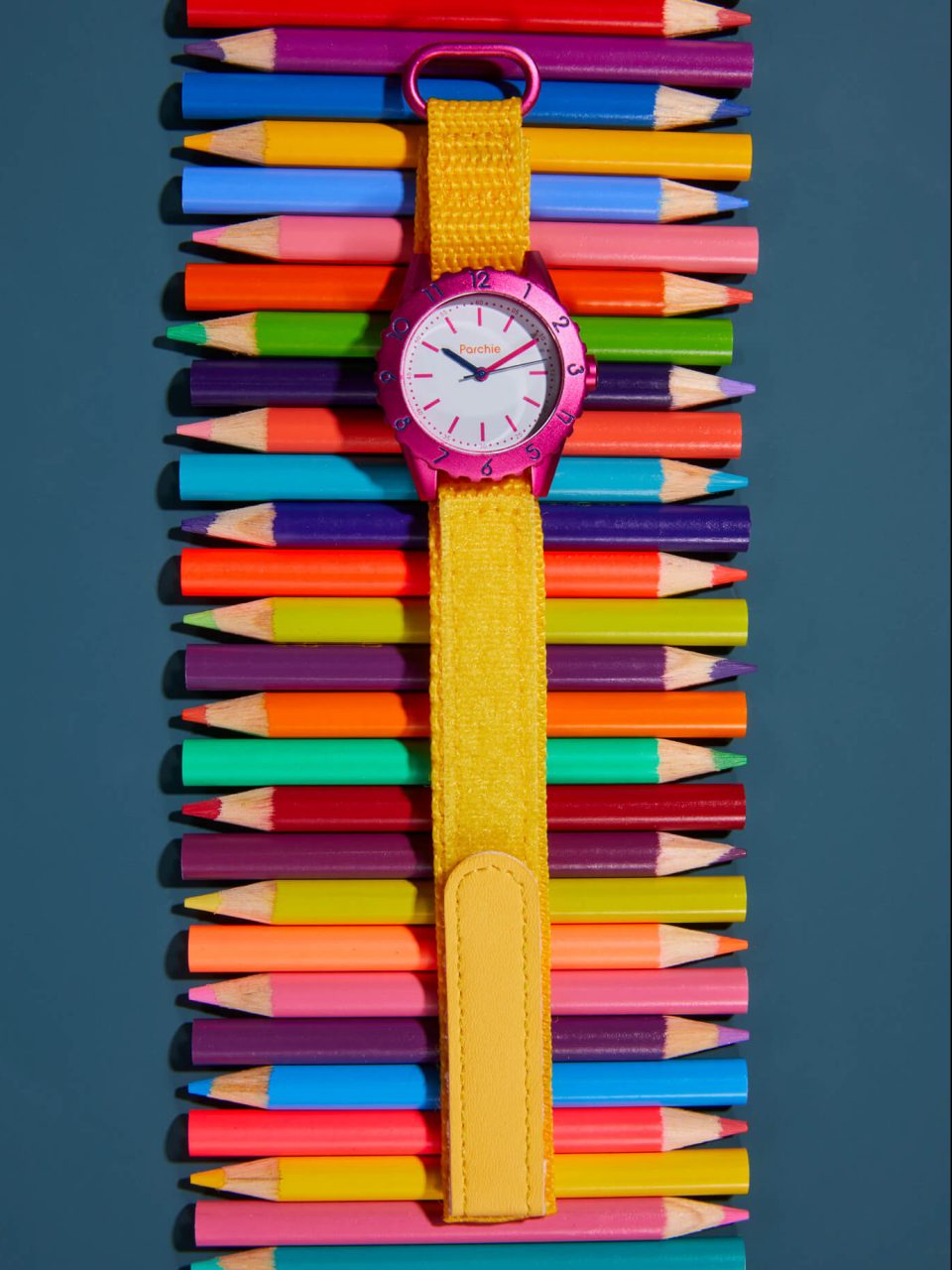
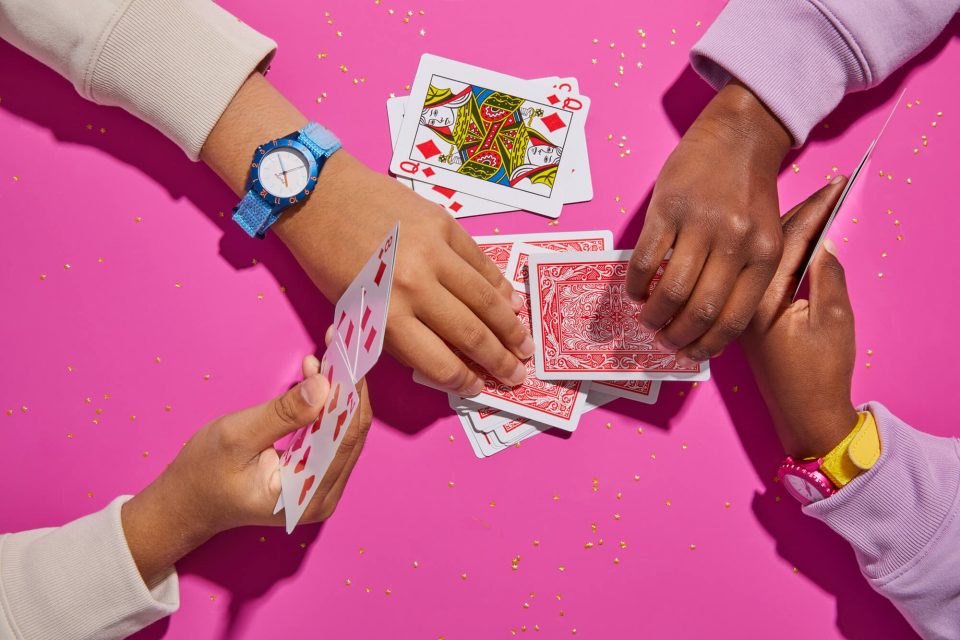
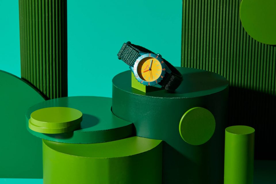
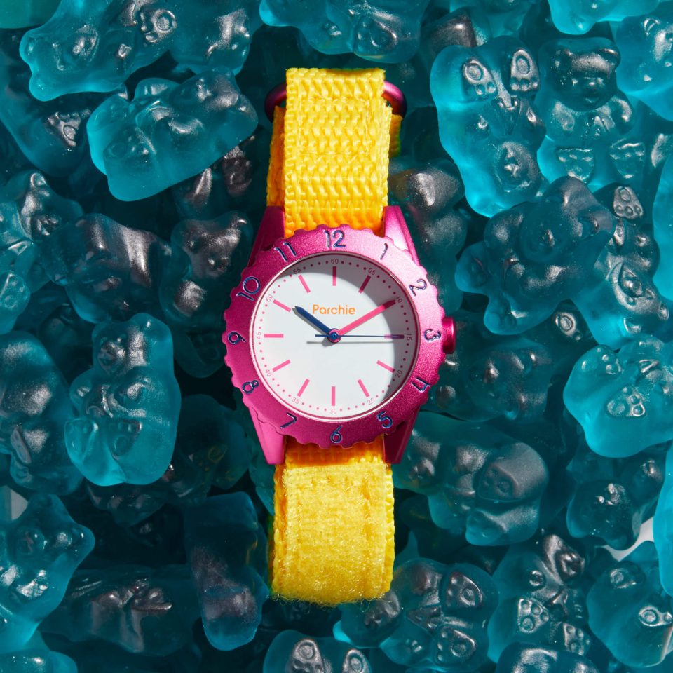
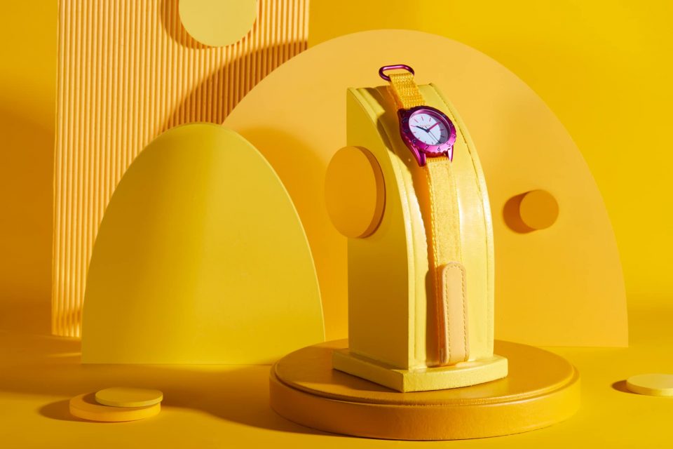
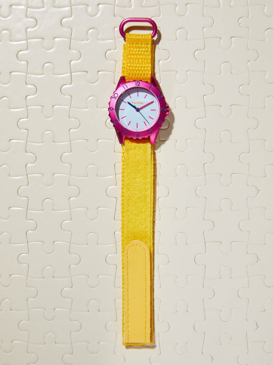
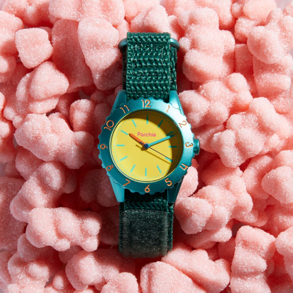
Parchie is a collection of classically designed, analog, three-hand watches for kids and the young at heart.
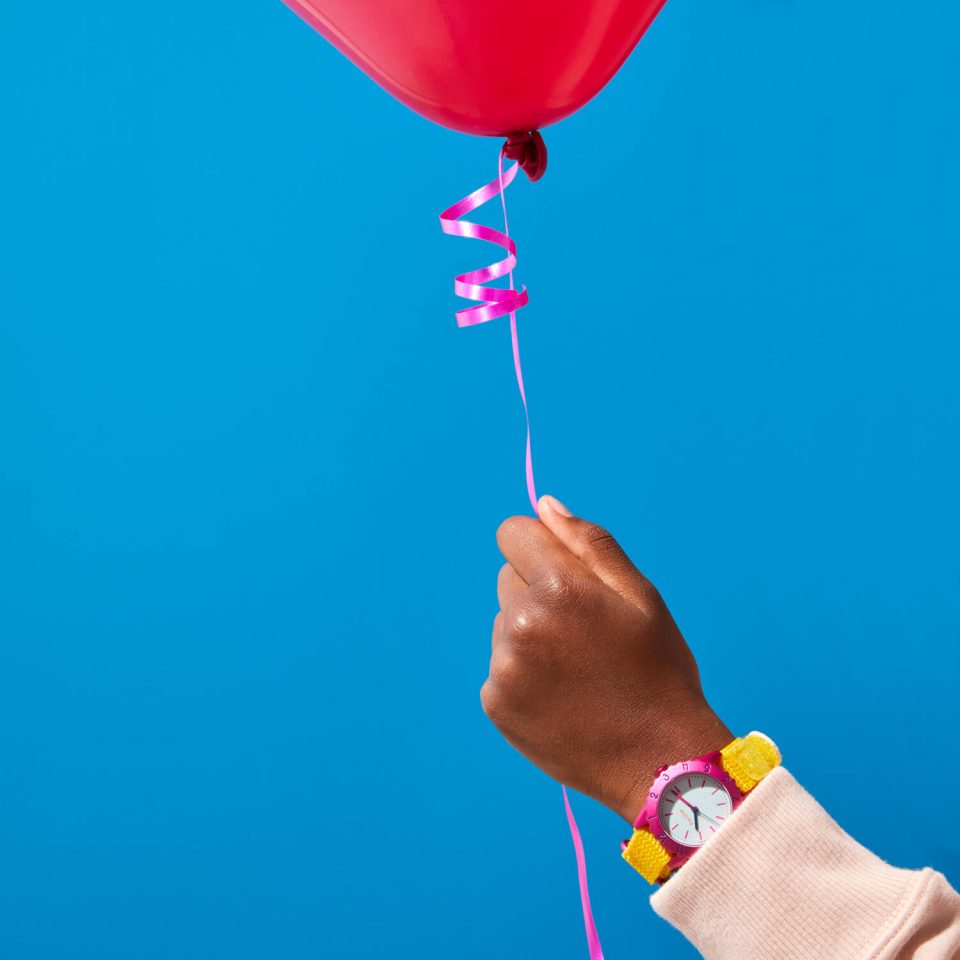
Named for founder — and luxury watch advisor, writer, and enthusiast, Cara Barrett’s invisible, imaginary childhood friend, Parchie timepieces are crafted with interchangeable watch straps made to mix, match, and collect. Designed to help kids learn to tell time and understand its many meanings, Parchie inspires us all to explore our creativity and be true to who we are.
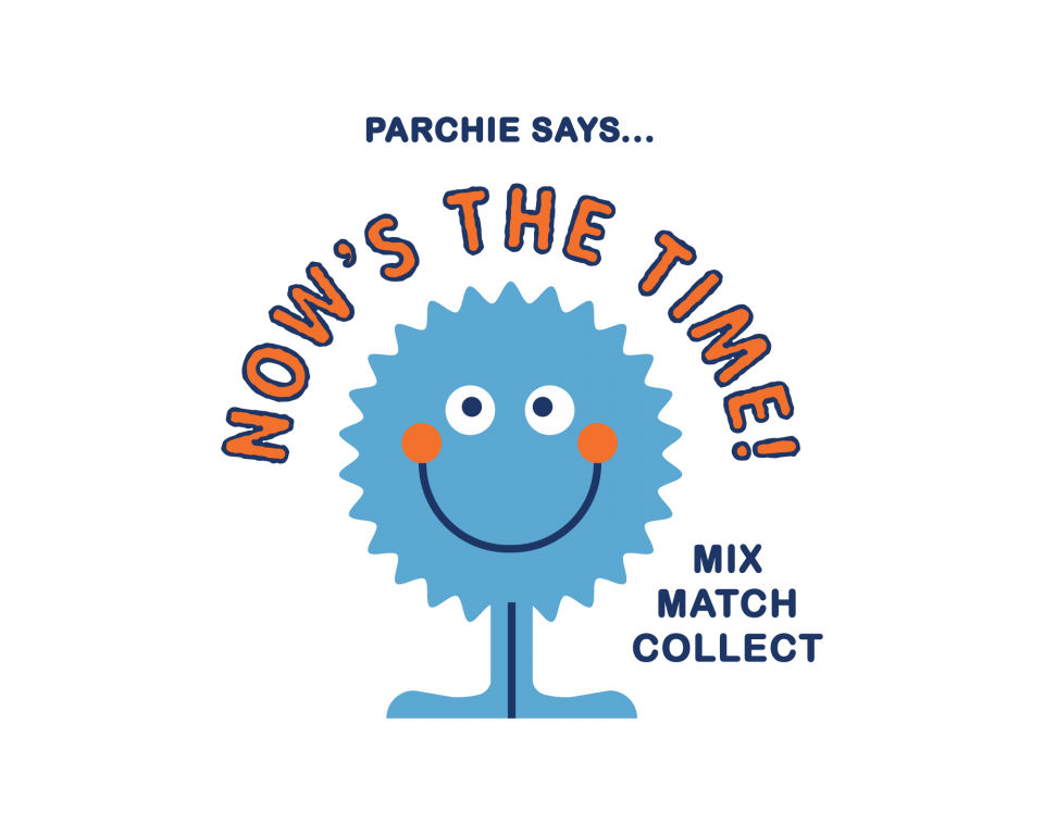
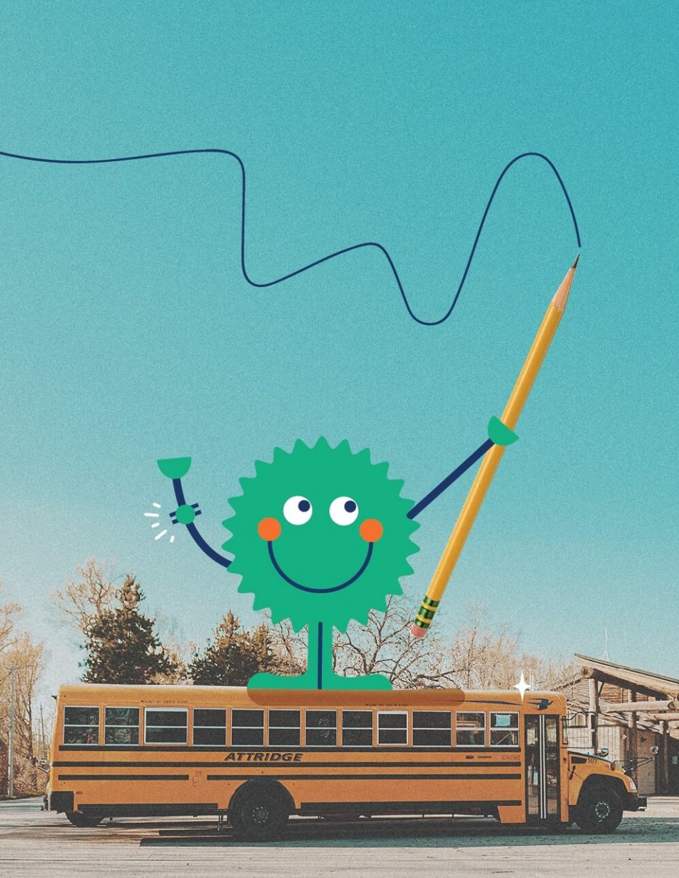
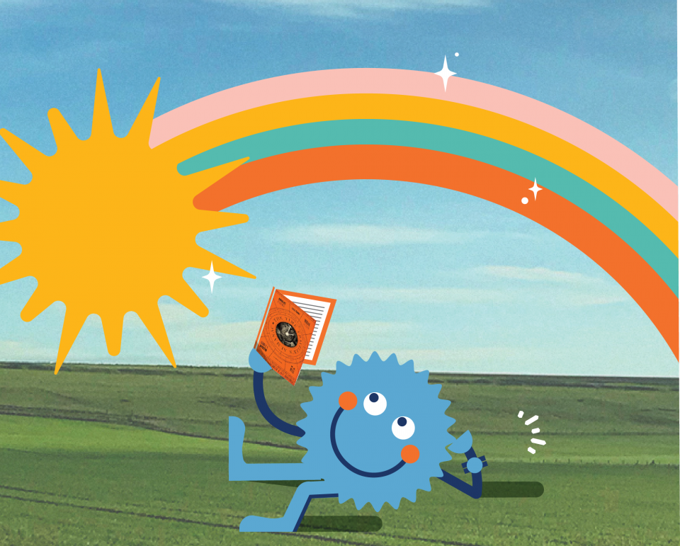
A hand-illustrated Parchie is the brand’s mascot — imaginary childhood friend brought to life.
Parchie’s face is intentionally designed to resemble a watch crown and bezel. Parchie’s color changes with his mood, creating opportunities for the brand to help kids define and connect with different, often-changing feelings.


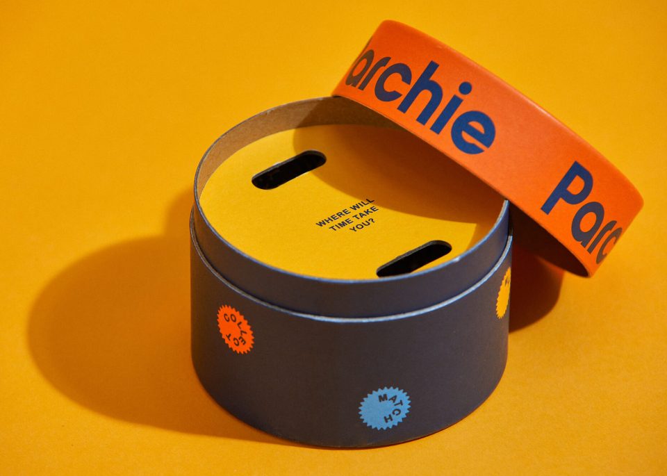
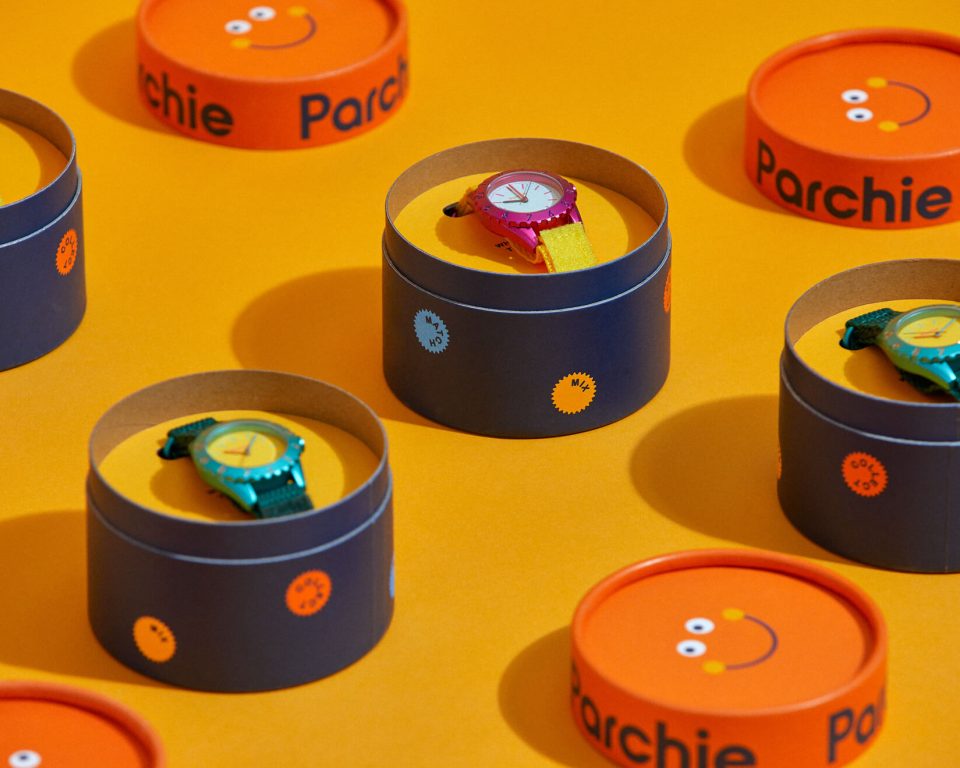
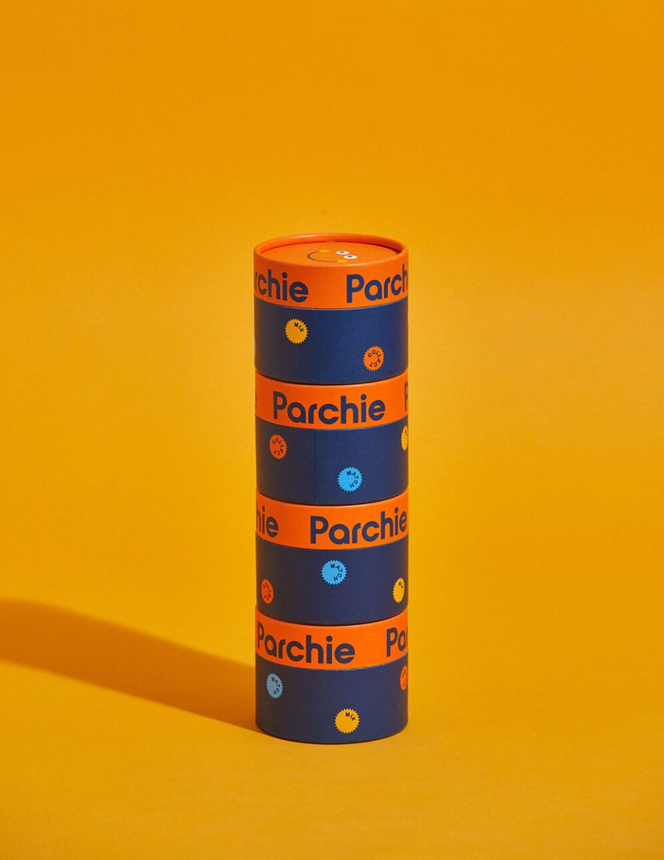
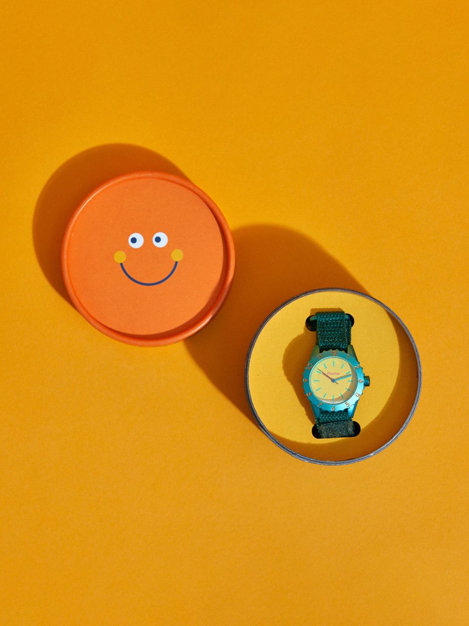
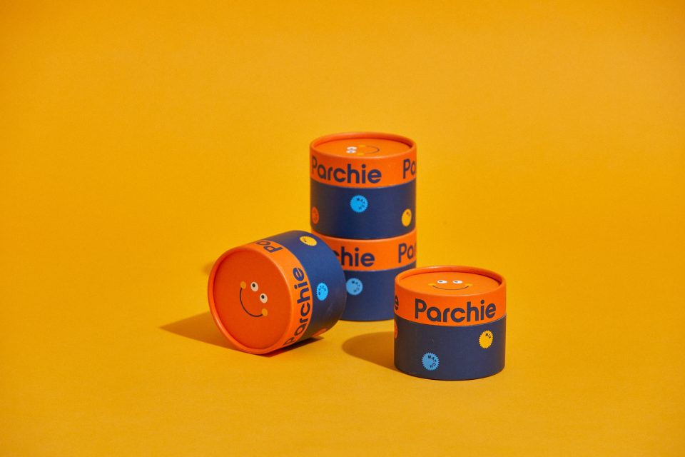
The packaging system includes a custom printed paper tube for a delightfully exciting unboxing experience. Proof positive that Parchie is winning hearts, adorning wrists, and sharing good times with the world.
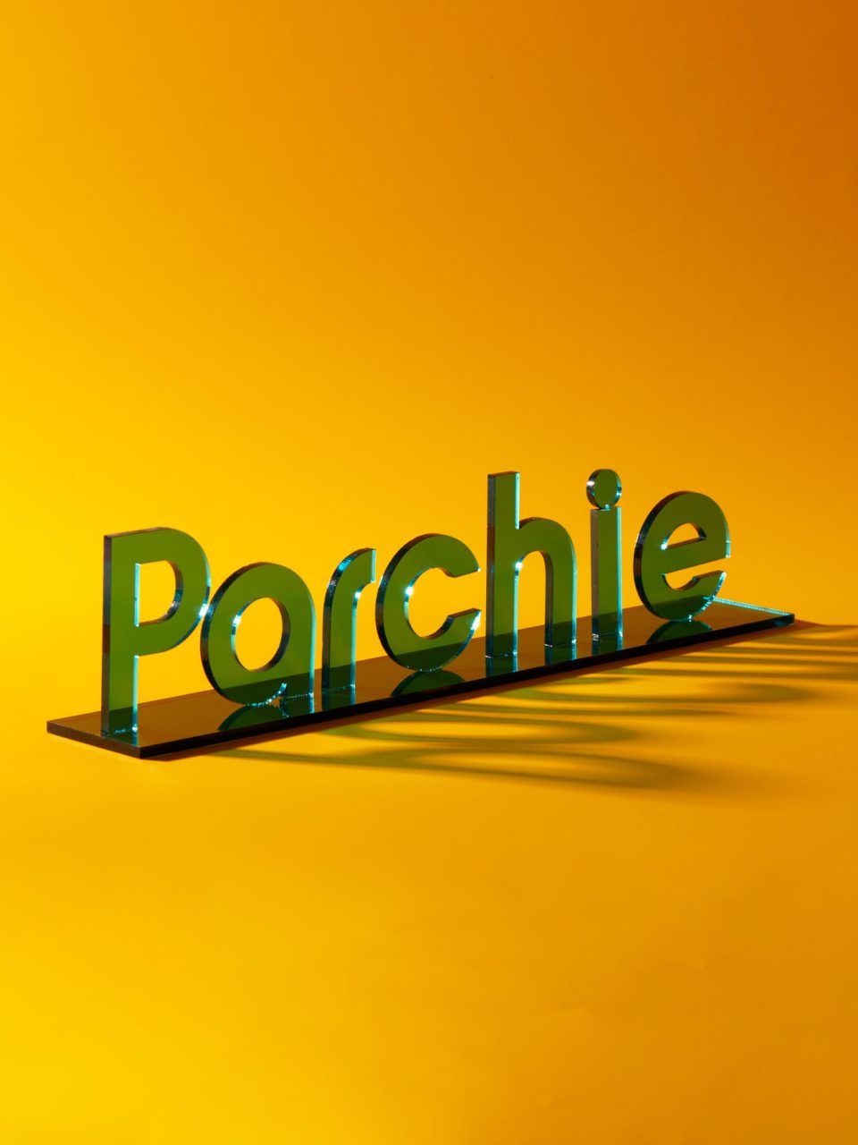

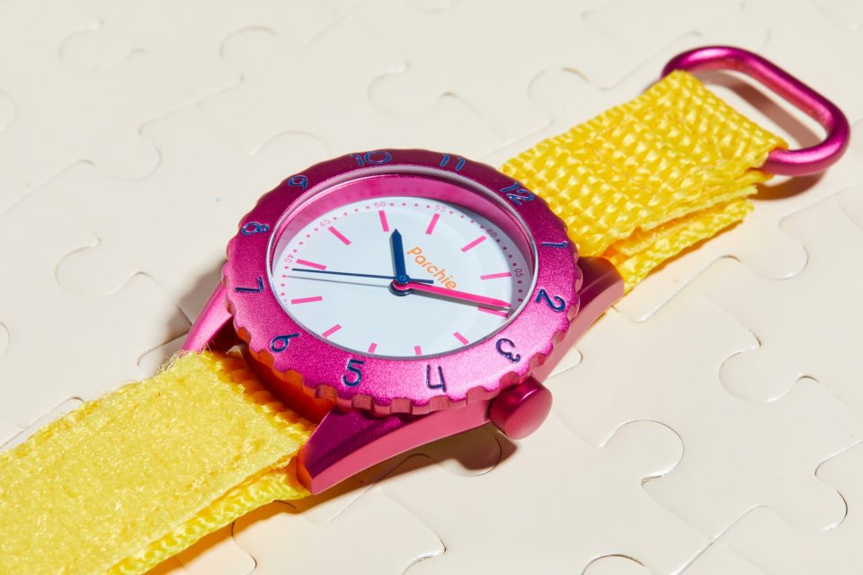
The letterforms reflect the brand’s quirky, classic aesthetic. Custom-designed numbers for the watch face reflect the brand’s expressive quirkiness.


The founder’s descriptions of Parchie serve as the joyful jumping off point for all design, story, and strategy. Parchie watches are the tiny canvases where wearers can paint the world the way they see it.

A collection of graphic elements create visual interest and flexibility while also infusing a sense of playfulness through clever, time-centric copy.


- Product Photography
- Alexandra Rowley
- Packaging Photography
- Kirk Roberts
- Styling
- Kathleen Jerry